

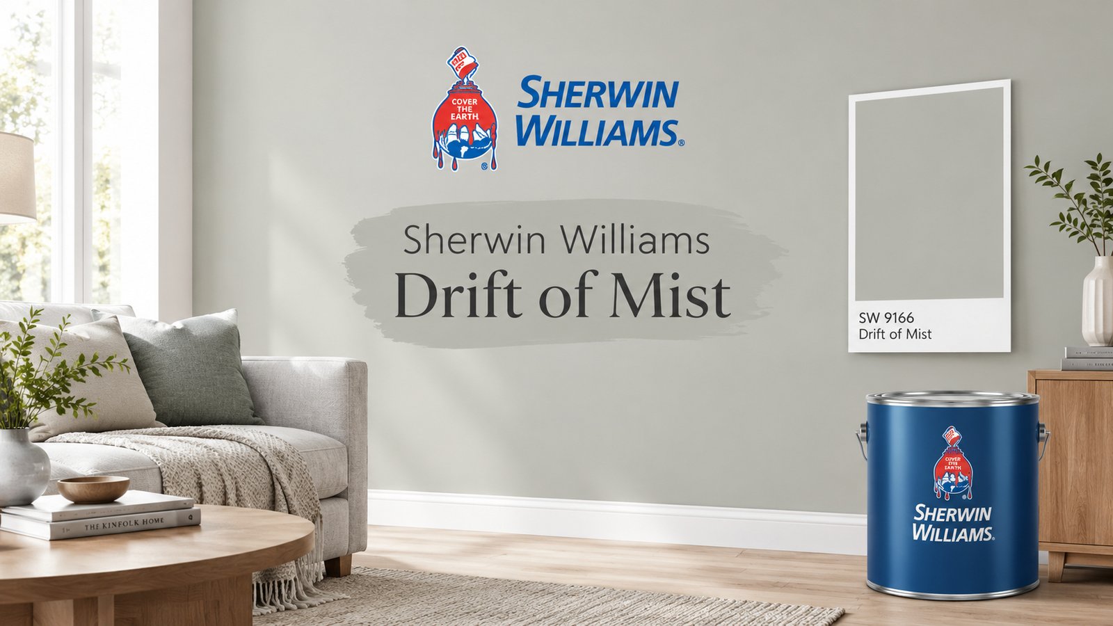
Sherwin Williams Drift of Mist (SW 9166) is a light, warm gray with a muted green-greige cast. It has an LRV of 69, so it reflects plenty of light. It works well in living rooms, bedrooms, and as a whole-house paint color. Or it performs poorly next to strong green or pink-purple surfaces.
This guide explains how Drift of Mist behaves in real light. You will learn where to use it, what to pair it with, and how to test it before you buy.
What Is Drift of Mist? A Quick Overview
Drift of Mist is a neutral paint color from Sherwin-Williams. It sits between a warm gray and a light greige. In bright light, it can read as a soft off-white.
| Attribute | Value |
|---|---|
| Color name and number | Drift of Mist, SW 9166 |
| Brand | Sherwin-Williams |
| LRV | 69 (listed as 69.14) |
| HEX code | #DCD8D0 |
| RGB | 220, 216, 208 |
| Hue family | Warm yellow-orange, very low saturation |
| Color family | Neutral, Designer Color Collection |
| Use | Interior and exterior |
Sherwin-Williams lists the HEX code as #DCD8D0. Other sites may show a slightly different value. HEX codes describe a color on a screen, not on your wall. Always confirm with a physical sample.
What Undertones Does Drift of Mist Have?
Drift of Mist has a warm gray base with a muted green undertone. The green is subtle, and it does not appear in every room.
Is Drift of Mist warm or cool? It is warm. The green cast makes it look softer and less yellow than many beiges.
Does Drift of Mist look green? Sometimes. The green shows up in these conditions:
- North-facing rooms with cool, indirect light
- Cool LED lighting at 4000K
- Rooms with green landscaping visible through windows
- Walls next to pink-leaning materials, which make the green stand out by contrast
Reviewers describe it in different ways. Some call it a warm gray. Others call it a greige or a soft off-white. This range happens because the color sits between categories. Some designers call it a chameleon color because it shows a color shift as the light changes.
How Light Changes Drift of Mist
| Room direction | What you will likely see |
|---|---|
| North-facing room | Grayer, cooler, and a stronger green cast |
| South-facing room | Warmer and creamier, closer to off-white |
| East-facing room | Warm in the morning, softer gray by afternoon |
| West-facing room | Neutral by day, warm and golden light in the evening |
Bulb temperature matters too. 2700K bulbs add warmth and hide the green. 4000K bulbs make the color look cooler and grayer.
What Does an LRV of 69 Mean for Drift of Mist?
LRV stands for Light Reflectance Value. It measures how much light a color reflects on a scale from 0 to 100. Black is near 0. White is near 100.
Drift of Mist has an LRV of 69. That places it in the light range, close to off-white but not quite white. For comparison, Sherwin-Williams lists Agreeable Gray at 60 and Gossamer Veil at 62.
Here is what that means in your home:
- Walls look lighter than the paint chip, especially on large surfaces.
- Bright south-facing rooms can look washed out.
- Dim rooms can look flat and gray.
- The color reflects light, which helps rooms feel open and airy.
Use a light reflectance value chart when you compare colors. It tells you more than the color name does.
What Are the Best Rooms for Drift of Mist?
Living Rooms
Drift of Mist works well in living room paint colors because it stays calm and neutral. It pairs well with wood floors, leather, and brass. Use eggshell on walls. Add Extra White or Alabaster crown molding for a soft contrast. Carry the same color into hallways to connect spaces.
Kitchens and Kitchen Cabinets
On kitchen walls, Drift of Mist works with white quartz countertops and stainless steel appliances. Gray granite can cool the color and bring out more gray.
On kitchen cabinets, proceed with care. The green undertone may clash with warm countertops. If you want greige kitchen cabinets, test the color beside your counters first. Use satin or semi-gloss for durability. A kitchen island in Naval or Iron Ore adds contrast.
Bedrooms
Drift of Mist suits bedroom paint colors because it creates a calm atmosphere. Choose eggshell or flat. Use 2700K bulbs to keep the tone warm at night. Add textiles and furniture in natural tones to support the color.
Bathrooms
It pairs well with marble and chrome. Choose satin for moisture resistance. Windowless rooms are a challenge. Artificial light makes the color look grayer, so use warm bulbs and test the sample after dark.
Exteriors
Drift of Mist works as an exterior paint color on homes that need a light, soft look. The high LRV makes it appear lighter outdoors than indoors. Sherwin-Williams lists it for both interior and exterior use.
Match it with these elements:
- Trim: Pure White or Extra White
- Front door: Naval or Pewter Green
- Shutters: Tricorn Black
- Style fit: board and batten, farmhouse siding, and craftsman trim
Paint a large sample on the home itself. Sunlight outdoors changes the color more than indoor light does.
Whole-House Color
Drift of Mist is a strong whole-house paint color if your rooms get similar light. Rooms with very different light will show different undertones. In that case, use it in your brightest spaces and pick a related neutral for darker rooms.
What Colors Coordinate With Drift of Mist?
Pick trim based on how much contrast you want.
| Use | Color | Effect |
|---|---|---|
| Trim, soft contrast | Pure White (SW 7005) | Clean and slightly warm |
| Trim, crisp contrast | Extra White (SW 7006) | Bright and sharp |
| Trim, warm contrast | Alabaster (SW 7008) | Soft and creamy |
| Ceilings | Ceiling Bright White (SW 7007) | Flat, even finish |
| Accent, deep blue | Naval (SW 6244) | Strong contrast |
| Accent, green | Pewter Green (SW 6208) | Earthy and muted |
| Accent, blue-gray | Waterloo (SW 9141) | Calm and cool |
| Accent, black | Tricorn Black (SW 6258) | Graphic and bold |
| Accent, warm | Cavern Clay (SW 7701) | Warm and earthy |
| Accent, dark gray | Iron Ore (SW 7069) | Deep and grounded |
| Accent, brown | Urbane Bronze (SW 7048) | Rich and dark |
What is the best white trim for greige? Pure White is the safest choice. It adds contrast without making Drift of Mist look dingy. Extra White works if you want crisper lines. Always test trim next to the wall color.
Drift of Mist vs Similar Colors
| Color | Brand and code | LRV | Main difference |
|---|---|---|---|
| Drift of Mist | Sherwin-Williams SW 9166 | 69 | Warm gray with muted green |
| Pale Oak | Benjamin Moore OC-20 | 68.64 | Warm gray, leans pink-purple |
| City Loft | Sherwin-Williams SW 7631 | 70 | Slightly warmer, more beige |
| Gossamer Veil | Sherwin-Williams SW 9165 | 62 | Darker and more greige |
| Agreeable Gray | Sherwin-Williams SW 7029 | 60 | Darker, muddier, warmer |
| Repose Gray | Sherwin-Williams SW 7015 | 58 | Darker gray |
Drift of Mist vs Pale Oak
The two colors have almost the same depth. Benjamin Moore lists Pale Oak at LRV 68.64. Benjamin Moore describes Pale Oak as a warm gray. Designers often note a pink-purple lean in it.
Drift of Mist leans green instead. Choose based on what surrounds the paint:
- Choose Drift of Mist if you dislike pink or purple tones, or if your wood floors lean red.
- Choose Pale Oak if you like a softer, slightly rosy neutral, or if you have greenery outside that you want to balance.
Drift of Mist vs Agreeable Gray
Agreeable Gray has an LRV of 60. It looks deeper and muddier than Drift of Mist. Choose Agreeable Gray for more depth. Choose Drift of Mist for a lighter, brighter room.
Drift of Mist vs City Loft
City Loft is very close. It looks slightly warmer with a beige undertone. Drift of Mist looks a little greener. Put both samples side by side before you decide.
Darker Alternatives
If Drift of Mist feels too light, look at Gossamer Veil, Worldly Gray, or Mindful Gray. For a warmer option, try Accessible Beige.
When Does Drift of Mist Not Work?
Skip Drift of Mist in these situations:
- Your floors lean pink or purple. The green may clash. Try a warmer greige instead.
- You dislike green undertones. You will notice them in cool light. Choose Pale Oak or Alabaster.
- Your room is very dark with no windows. The paint can look flat. Pick a warmer neutral with a lower LRV.
- Your room gets intense direct sunlight. The color can look washed out. Pick a slightly deeper shade.
- You want a crisp white. Choose Pure White or Extra White.
Avoiding the wrong greige saves you the cost of repainting.
Also Read:Interesting News CloudySocial: Coverage and Trust Check
How Do You Sample Drift of Mist Correctly?
Test the paint in your own home before you buy gallons. Follow these steps:
- Choose your sample type. Use a sample pot or a peel-and-stick sample from Samplize. Peel-and-stick samples let you move the swatch around easily.
- Make a large swatch. Paint a 2×2-foot swatch on a piece of poster board. Small chips mislead you.
- Place it on two walls. Pick one wall with direct light and one in shadow.
- Leave it for 48 hours. This 48-hour test shows you the color in morning, afternoon, and evening light.
- Check it under your bulbs. View it under both 2700K and 4000K light.
- Compare against your finishes. Hold it next to flooring, countertops, and trim.
- Test two alternatives. Add Pale Oak or City Loft to your test so you can compare directly.
Do not paint swatches over an old wall color. The old color changes how the new one looks.
Real-World Scenarios
These scenarios show how Drift of Mist responds to different conditions.
1Scenario: North-facing living room with gray stone
- Problem: The homeowner wanted a bright, neutral living room, but the room gets cool light.
- Action: They sampled Drift of Mist and Pale Oak, and checked both after dark.
- Result: Drift of Mist looked grayer in the day, while warm 2700K bulbs reduced the green at night. They chose it with Extra White trim.
2 Scenario: Kitchen with white quartz and oak cabinets
- Problem: The owner wanted soft wall color without a yellow cast.
- Action: They painted a 2×2-foot swatch next to the backsplash and counters.
- Result: Drift of Mist looked clean and calm beside white quartz. They used it on the walls and kept the oak cabinets.
3Scenario: Farmhouse exterior with board and batten
- Problem: The homeowner worried the paint would look washed out in full sun.
- Action: They painted a large sample on the siding and viewed it at noon and sunset.
- Result: The color looked lighter outdoors. They added Pure White trim and Tricorn Black shutters for definition.
Frequently Asked Questions
Is Drift of Mist gray or beige?
It is a warm gray that leans toward greige. It is not a true beige.
Does Drift of Mist have green undertones?
Yes. The green is muted and shows most in cool or north-facing light.
Is Drift of Mist a good exterior color?
Yes, for homes that want a light, soft look. Pair it with darker trim to avoid a washed-out result.
Is Drift of Mist good for kitchen cabinets?
It can work, but sample it first. Test it against your countertops and backsplash.
What is the HEX code for Drift of Mist?
Sherwin-Williams lists it as #DCD8D0. Its RGB values are 220, 216, 208.
Is Drift of Mist the same as Pale Oak?
No. Their LRV values are close, but Drift of Mist leans green and Pale Oak leans pink-purple.
Data sources: Sherwin-Williams color page for SW 9166 (LRV 69.14, HEX #DCD8D0, RGB 220, 216, 208) and Benjamin Moore color page for Pale Oak OC-20 (LRV 68.64).